Monday, April 30, 2012

Music as Space - An Environmental Interface

Our final project of the semester in environmental studio was to design a musical interface for a space along Market Street at the edge of campus where the Music building resides. Using the topographical map  and building, we created an interface (a boundary between two entities) that was designed for several functions:

- it should physically engage pedestrians walking along Market Street
-it should visually engage motorists driving along Market Street
-it should be expressive of music in its relation to the Music Building
-it should act as an interface between UNCG and the Lake Daniel neighborhood
-it should reinforce the architectonic qualities and acoustic potential of the resulting space between the interface and the Music Building
-it should enhance those qualities of the architectonic space as an outdoor concert venue

We started this project with a visit to the actual site.

The view from Market Street, looking South.

Houses across the street from Market, some of the trees and the brick retaining wall.
The ideal acoustic spot for a stage. 
Note the topography of the space (from the edge of Peabody Park).
I started with a three-dimensional concept and a few words to provide focus for my design. I wanted to investigate line through space and how it creates space initially.


interaction
elasticity
flow
zone
compression
movement
shape
line
negative space

From there, I began to consider the use of the space in its entirety. I realized several obstacles to creating any sort of interface for the side of the music building, and primarily my biggest concern was attracting people to the space and keeping them there. The music building is set back from the rest of campus, and I found that on several occasions when walking back, I wanted to stop for a bagel and coffee on tate street, which was a little roundabout of a route back to studio. This realization prompted me to consider adding in usable space for a potential cafe and an area for gathering and relaxing as a destination site in and of itself. Additionally, I originally thought to put the stage down towards the Peabody Park tree line, but upon further investigation of the site itself, I realized the ideal location acoustically is actually at the corner of the two main Music building walls. This allowed for a redefinition of the space in its entirety, and suddenly I found myself redesigning my interface to allow for both an attraction and flow of people from Market St, but also an acoustic barrier to the traffic and the music venue itself. 

This process started with a few sketches in plan, and then the construction of a space realized in a three-dimensional form. 


I then looked to materials, keeping in mind that I wanted the roof of the space to contrast to the material of the actual wall itself. I proposed concrete for the walls and architectural mesh for the roof to allow sunlight to filter through while still providing shade.


Design Visualization Assignments - A Recap

A quick assignment recap from the second half of the semester. 9 sketches of observations from Fallingwater and Monticello, from our trip


We then worked on our value skills with two pieces of a larger Fallingwater picture.


Drawing on our 2-point perspective skills that we had learned from our projects, we went out to the Music Building to practice drawing on-site.


Our next assignment involved drawing our faces.


And finally, scale-figure renderings in the correct proportion.


Friday, April 27, 2012

Unit Summary 3: Explorations


http://25.media.tumblr.com/tumblr_lvleghChaF1r7zwkeo1_500.jpg


The final unit is aptly named “Explorations” as there is a cacophony of voices questioning the rules of architecture and the best style. Most of this unit involves questioning, breaking and redefining the rules of architecture that were written in the Renaissance. We are still questioning those rules today. 

We started this unit in week 11 with a look at the world’s fairs. Hosting the world fairs had several goals: an exploration of style, to reinforce political relationships and a celebration of national cultural identities. Within each fair there were displays designed to entertain and enlighten with art, culture, industrial and manufacturing innovations. Because these were temporary sites that attracted large amounts of tourists, the architecture was temporary and constructed off-site in a kit of parts and transported and set up for the fair duration. A prime example is the Crystal Palace, the original building for the first world fair made of iron and glass that was assembled within six months and spanned across a large London park, covering over a dozen fully matured trees. After 1933 the tone of the world fairs became more futuristic, often looking forward with technological and architectural innovations.

With the fairs, a conversation on substance and style became a driving force for exploring architectural options. At the turn of the twentieth century, the greatest debate was handcraft or machine as the ideal design aesthetic. As Charles Ashbee said, “we do not reject the machine. We welcome it. But we desire to see it mastered.” However, as the world entered into the first world war, I think most of the hand crafted cultural standard went into the trenches and never came back out. Instead, we have the rise of the Bauhaus in Germany and the machine aesthetic. Walter Gropius and his fellow Bauhaus teachers pushed the concept of “good design for all” with an emphasis on making new rules for architecture and design principles. Le Corbusier’s Villa Savoye (image at top) pushed this the furthest with his 5 rules for architecture and his new design for upper class country estate housing that contrasts sharply to the previous standard of Palladio’s design.

After the world wars, western society begins to search for a definition to modernism. The machine aesthetic quickly leaves the public behind, and this conversation turns more to a design community specific conversation, especially with the international style and the American skyscraper race or height. The key with the international style is that the design looks the same internationally as there is no local flavor to the design. This reflects the new global community and the trends towards globalization with less emphasis on the individual and more on the corporations and where the international economy is moving. 

The current discussion of design and architecture is back to where we started, with an exploration of the meanings and human interaction with design. There are many reactions to modernism in the contemporary design world, and most of those reactions fall within three major camps. The history camp includes the post-modern response to architecture with a link to history and other types of design. This also includes historic preservation. Technology lends itself to the deconstructivist style with its hi-tech innovations. And finally there is a local response that emphasizes regionalism and sustainability in design. This sustainable discussion is the most pressing issue for contemporary society today, and I personally think that it should be combined with historic preservation as we attempt to define and direct the new path in architecture. 

Thursday, April 26, 2012

BP14: personal design recap: object, space, building, place

One of the foundations of this course is the exploration of design at various scales: object, space, building and place. While a general, cohesive style has yet to fully develop for me personally, there are definitely trends that I am beginning to see in my own past experiences and current designs. This is my design recap at the four scales that we discussed.

1. Object: Canon PowerShot. 


http://a.img-dpreview.com/news/1008/canon/compacts/PowerShot-SX130IS-FSR-BLACK.jpg

Perhaps it was the several years of working part-time for a photographer in High School, or maybe it is just my obsession with images and their composition, but I very rarely go far without my point and shoot in my bag. I have a nicer Canon DSLR that I bring along for wedding gigs and fancy travels, but overtime I have found keeping a decent camera in my bag indispensable for recording any and all inspirations. While I have been working this semester on developing a visual language for recording in my sketchbook, I am still saving upwards of a hundred images a week that have either been captured personally or seen elsewhere. The design features that I like the best about this camera are its size (fits well in my hand and is relatively lightweight) and several functional features like an optional manual flash, easy card access, stable zoom capabilities and a generous screen for reviewing images. I have had various point and shoot models over the years and this digital option is my favorite by far and one that I have willingly replaced with the same model (after an unfortunate coca-cola meets camera incident). 

2. Space: Jonathan Adler's Booth at High Point Furniture Market.

http://www.cococozy.com/2012/02/latest-from-my-design-crush-jonathan.html

Despite all of our discussion this semester on what constitutes "good" design, I found that upon wandering the High Point Furniture Market this week for hours, Jonathan Adler's booth was still one of my favorites, and this stood out to me when considering a space that reflects my design style. He started as a potter in NYC and has gradually built up his design to now branch into furniture, textiles, rugs and the like. What I appreciate the most about his design is his modern take on form and function with his insistence on throwing in a twist of delight with bright colors, energetic patterns and a theory of "good design for all." Looking at my own design aesthetic in my house, it is similar to Jonathan's with my art on display in every room (mostly sculptural), furniture pieces selected for their form and clean lines and energetic colors throughout. In the furnishings world, I enjoy his response to the machine-like aesthetic by making it engaging with the consumer.

3. Building: Frank Gehry's Guggenheim Bilbao

http://www.guggenheim-bilbao.es/img/all/el_museo/foto_postal_03.jpg

I know I have posted on this building before, but I am choosing this mostly as inspiration and a defining moment of when I first recognized architecture on an intellectual level. Frank Gehry's designs often get criticism for some major design flaws (like complete ignorance of the reflective quality of titanium metal panels and the distribution of heat in nearby apartment buildings, for one) but having actually seen this museum and explored it, I use it as inspiration for thinking outside of the modern Bauhaus box. We recently designed a musical interface for the UNCG campus and I kept thinking of the fluid forms that he has in his designs when trying to create "music as space" in a three-dimensional architectural form. 

4. Place: Paris.

http://www.hotelpulitzer.com/blog/wp-content/uploads/2009/06/paris-transport.jpg?w=300

Perhaps a romanticized view of this city, but the brief time I spent there left me with a desire for more. The culture, architecture, history, art, fashion, food, urban planning... if there is a place in the world that I would jump at the chance to go and explore further, it would be Paris. There are so many significant buildings there that I want to see and study in more depth. From the Paris Opera, to I.M. Pei's entrance to the Louvre and remnants of the Rococo style, there is a mash-up of historical hand-crafted and modern architecture that I think would be fascinating to study further. Additionally, I am now entranced at the end of this course with learning how to integrate contemporary societal needs with the historical and modern buildings that currently exist. I do not think that the current American solutions to this situation is working, and I would love to go to other places that have existed for many more centuries to explore other options. Throughout this course I felt like I was given the tools to make connections between the various cultural and historical trends in architecture. 


DA4: I Like to Ride My Bicycle!


Travel Coffee Mug + Bicycle =


A Travel Coffee Mug Holder!!
-clips to your bike
-it's a sustainable explosion!

Prevent unnecessary waste & reduce pollution - take your coffee to go while riding your bike. The world will only love you more. 

Thursday, April 19, 2012

Funkytest!

Our Funkytest was an hour drawing in 2pt perspective, in four colors in a location of our choice. I chose a corner of the student lounge in the studio arts building, and after a quick thumbnail sketch, drew the image at the bottom. The missing subjects from the room are Claire and Michael. 


Monday, April 16, 2012

BP13: Ikea's Scandinavian Modern Design for Everyone

http://www.ikea.com/us/en/catalog/categories/departments/bedroom/tools/bedroom_rooms_ideas/
One of the tenants of "good design for all" is affordable, thoughtful design for the majority. One of the leading companies with this pedagogy is Ikea, with their self-proclaimed "Scandinavian modern style furniture and accessories." I chose this image, one of the current bedroom inspiration images on their site, as an example of modern furniture collected in a room. There is minimal ornate decoration, with mechanized woodworking and clean lines. I think the appeal of Ikea is its affordability and accessibility for those who want modern furniture without spending a lot of money. It's pervasiveness in American culture can be seen with its large scale modern warehouse stores cropping up around the US in major highway intersections, its anticipated yearly catalog that gets re-posted in blogs, and the additional "Ikea Hacker" sites that demonstrate how to take the Ikea base product and refit it for personalized spaces.

Sunday, April 15, 2012

RR 13: The Race for Height - Skyscrapers & Globalization

According to Ching in the final pages of his textbook, "the tension between the global and the national is the fundamental paradox of our age" [797]. I found this commentary to be fascinating and immediately applicable for the discussion of the skyscraper height race that both Ching and Roth delve into in the final pages of their texts. Globalization and a market driven, corporate minded world economy has directly impacted the world of architecture as each corporation and nation compete against each other for the largest and tallest skyscraper as a symbol of their power and wealth. Some of the tallest in the current race include:

http://blog.kievukraine.info/uploaded_images/5161-760392.jpg
  • The Commerzbank in Frankfurt, Germany is the tallest building in Europe at 850 feet. Notably, this building is also green-certified, including sky gardens and sheathed in aluminum. 

http://funpresident.com/wp-content/uploads/2009/03/jin_mao_tower_02.jpg
  • Outside of Europe, Shanghai has competed for the place of principal interchange between the East and West, and this has culminated in a height race among skyscrapers within the city. The 88-story Jin Mao Tower (above) was the first of these, developed by Skidmore, Owings & Merrell at 1380 feet.

http://www.architectmagazine.com/Images/tmp7FB6.tmp_tcm20-231931.jpg
  • The Shanghai World Financial Center (above), virtually next door to the Jin Mao Tower, was developed by Kohn Pederson Fox with 101 floors or 1614 feet.

http://tiscsvr.tbroc.gov.tw/photo/120/001/120-001832.jpg
  • Taipei 101 (above), in Taipei was designed by Taiwanese architect C.Y. Lee, at 101 stories or 1670 feet, including its spire.
http://purplefok.com/ghs_ict/ifc.jpg
  •   Two International Finance Center (above) was completed the same year as Taipei 101 in Hong Kong, also by Cesar Pelli at 1,362 feet. 
http://0.tqn.com/d/architecture/1/0/b/v/BurjDubaiFlickr.jpg
  • The current tallest building in the world is the Burj Dubai (above), in Dubai, United Arab Emirates, designed by Skidmore, Owings & Merril that reached an astounding 2723 feet. 
Of course the height wars are not over, and with increased technology from the information age and CAD, new proposals are submitted. A third skyscraper for Shanghai is scheduled to be completed 2014 that is also over 2000 feet, designed by Gensler (image below).

http://www.archpaper.com/news/articles.asp?id=3087
As the large global architecture firms compete for commissions for the greatest vertical structures, I find that this race for height is personally disheartening in its waste of materials and complete disregard for larger, non-ego driven global needs like sustainability, environmental concerns, and poverty. A tall skyscraper, while increasing name brand recognition during the moment of greatest height achieved fame, does not directly increase the overall profit gains for the company in the long run. A skyscraper in itself does not generate more income.

However, in a discussion of where the design world might be headed, I do think that these geographical landmarks are indicators that a Western centralized global economy is on the decline, while a more Eastern economy is increasing in dominance and leading the conversation of a globalized economy. I think that we will see more of an Eastern influence in the everyday design culture here in the West as time progresses. For me, this is a reminder to look beyond my current surroundings and instead to the international stage for new ideas and direction.

Wednesday, April 11, 2012

Fallingwater and Monticello

 A few weeks ago, the first year class and several iarc department professors and grad students took a field trip to Monticello and Fallingwater over a 36 hour time span. It was a whirlwind trip consisting of long hours in the bus, but was well worth the travel time to see these two monumental places. We started with Monticello on Sunday and saw Fallingwater on Monday (and were back home from PA that night!). Below is a small collection of photos from the trip.
me & tj


the winding road up to tj's house

front facade

the backside of the hizzouse

from across the expansive lawn

crops!

tulips :)

tj's wu-wu

the long winding path back downhill - i loved the purple & green combo. thanks nature!

thonet knockoffs in the cafe

tj on uva - doric column repetitional glory

the prestigious quad housing at uva - everyone has a grill, lulz

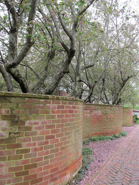
i'm really digging this side path & garden wall

uva chapel

undulating with desire

oh hello, frank

i wish my porch steps landed in a river


compression & horizontal layers in full frank glory

out of the rock

don't jump! its too shallow!

front facade across the rio

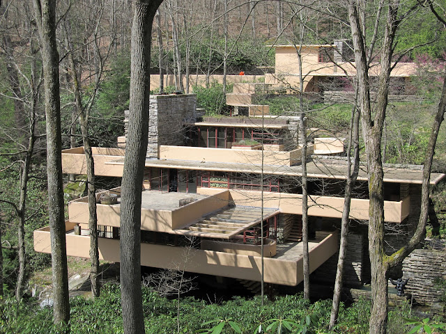
ah yes, the classic fallingwater shot (notably the site that the Kauffman's actually wanted their house built on)

and from above, with a look at the guest house. where i would live. with my pool boy.