Wednesday, March 28, 2012

RR10: Iron & Glass Explorations in the Bibliotheque


 Henri Labrouste studied at the Ecole des Beaux-Arts in 1819 at the age of 18. He won many design competitions during his time there, but was notable for challenging the contemporary teachings of design. He believed that "buildings arose as expressions of unique functional and social environments and not as universal prototypes." (Roth). The Bibliotheque Sainte-Genevieve in Paris is noted for his intent to explore this theory.
http://4.bp.blogspot.com/_WjxCfiYRwsM/TLPbLiJaxKI/AAAAAAAAAPI/mtWJiZEJoXY/s1600/Biblioth%C3%A8que+St+Genevi%C3%A8ve+Paris.jpeg
 The exterior (seen above) has a nod to classical architecture, with repeated arches, and the double layers reminiscent of the Medici house in Italy. The symmetrical floorplan (below) is also loosely associated with the classicist past, with the inclusion of the large portico on the front.
http://www.greatbuildings.com/buildings/Biblio_Ste_Genevieve.html 
New technologies of glass and iron greatly influenced the interior of the building. Designed for a large reading room on the upper floor, the glass supported by iron framework spans the great hall while allowing daylight into the room. This was the first library designed that was not restricted to daylight with lamps for nighttime reading. 

http://www.greatbuildings.com/buildings/Biblio_Ste_Genevieve.html  
 The section (seen above) helps illuminate several of the innovations that Labrouste incorporated. These include:

- double barrel vaults supported by thin iron transverse arches
- thin iron center columns with stone columns on the outer walls
- no "superfluous" classical ornamentation
- arcade of glazed glass so daylight could stream in

http://farm5.static.flickr.com/4145/5005456844_c83b7e2727.jpg
The completed interior (seen above in the present day) was groundbreaking as an essay on commodity, firmness and delight in equal parts that harks back to Vitruvius. Additionally, the theories of Labrouste created a new desire for the "external character of the building arising from the inside function projected to the outside." (Roth).

For me, I find that the theories that we have discussed all semester of commodity, firmness and delight are being explored intellectually by architects. Additionally, the interior space shaping the external space is an interesting change of design methodology. So often I find that we take inspirations from the outside world, when the argument here is to consider the use of space first, and design the creation from that. The explorations of how this idea is to come about is of great interest to me in the final weeks of this semester.

BP10: iphone & a revolution

http://iphoneapplicationlist.com/wp-content/uploads/2009/07/jobs_and_iphone.png
Smart phones are so well integrated into the current daily fabric of modern American society that their revolutionary state is almost forgotten. There are many features of the current smart phone, which began with the original iphone, that in my opinion stated a revolution of ideas and expectations in communication:

- calling capabilities to anywhere from anywhere
- the concept of 'texting' on a keypad on a single touch screen interface
- image capturing along with the ability to share instantaneously
- internet connection anywhere with email access and updates
- social network abilities onto facebook, twitter, etc
- "apps" as individually created for any personal desires (games, organization, lighting, etc)
- gps and maps inform your exact location and the distance and estimated time to a specified location of the user's discretion

All of these (and more!) uses are completely revolutionary. No more giant phone book, phone booth, quarters, foldable maps, or more importantly disconnecting from the rest of the world. The transfer of ideas is instantaneous and has completely revolutionized businesses, ideas, elections and only further encouraged globalization.

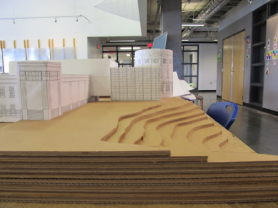
an environmental interface: a Music Building topo


Starting with a topographical map in 1/8" : 1' scale from the UNCG facilities office, a 2' difference in elevation was determined between each line on the map above. The tan area is the footprint of the music building, and the gray area is poured asphalt.


Project 2.1: In the kitchen with Karyn


Project S.1: plan, section, 1&2 pt perspective


Monday, March 19, 2012

[RR9] the Whimsical Royal Pavilion & the new Modern Era

The Royal Pavilion was built from 1818-1822 for the Prince of Wales. The architect was John Nash who specialized in the white Neoclassical palaces that were super popular in this time period. The Royal Pavilion, however, is a strange hybrid of the Eastern and Western style architecture that is quite fantastical and imaginative.

http://austenonly.com/2011/06/22/the-royal-pavilion-brighton-and-dress-for-excess-part-2/
Given the manor house style that was common in England during this time, with the central house and two flanks, the Royal Pavilion follows this basic schema for its design. However, the roof, columns, and minurets quickly depart from there. Looking at the plan (below) the building is quite symmetrical in plan, which was also quite common during the time period.

http://austenonly.com/2011/06/22/the-royal-pavilion-brighton-and-dress-for-excess-part-2/
In this period of colonialism and international trade, it is hardly shocking that different cultural influences would be reflected in the architecture of the noble elite. In the image below of two women in period dress, there is a corner of the front facade that shows some of the Arabic influenced geometrical decoration. This type of architectural statement clearly announces the worldliness of the Prince of England and his far reaching power.

http://austenonly.com/2011/06/22/the-royal-pavilion-brighton-and-dress-for-excess-part-2/
This building was also innovative structurally, as it has a foundation that is mostly steel. Additionally, its dome was supported by a cast-iron structure. This feature announced the modern era. Another view of the facade and dome at dusk is below.

http://wikitravel.org/upload/en/4/40/BrightonRoyalPavilion.jpg
According to the official Royal Pavilion website, "the completed Royal Pavilion was considered progressive for its time.  It was designed to incorporate the latest technology and equipment to meet the king’s demands for warmth, comfort and convenience." Some of these amenities included:

- Gas lighting, which was introduced for the first time to illuminate the painted-glass windows.
- The kitchen had the latest gadgets.
- Local springs provided fresh water, and there was a flushing toilet in the King's chambers.
- Artist-designers Frederick Crace and Robert Jones combined opulent decoration with the finest furnishings for the interiors.
- Regency gardens of the fashionable naturalistic style with winding paths and drives (seen below).

http://www.gardens-guide.com/gardenpix/0171_RoyalPav.jpg
I find the Royal Pavilions to be highly imaginative and indulgent for a time period that was obsessed with the Neoclassical style. I find that this building follows heavier on the "delight" spectrum for me, which is quite interesting since John Nash was infamous for his other work solidly falling within the firmness and commodity side of the equation. As far as Reverberations goes, I find that this building does an excellent job of taking the expected and turning it upside down. Interestingly, the next project that King George and John Nash work on together is Buckingham Palace, which is back in the strict conservative Neoclassical style that is so present in England in this time period. To me, this building is an excellent example of why allowing your imagination to run wild in design can create something new and rewarding, and that perhaps challenging the norms and standard conventions should be encouraged in certain circumstances.

[BP9] Architecture that Talks: Guggenheim Bilbao

https://blogger.googleusercontent.com/img/b/R29vZ2xl/AVvXsEhWgrSRW1QPiv45F8raLLdV7wVSVkKBqtko2Viw3qVh0XNy8zsmGEQtjAXU56kd_heGjZvZviBdZTO5pQRpo5bicaIE0F_Jw_-mSrj8hct1wuATp8VQUI8wS2qiGrpob9TKwPi0RqFY_TE/s1600/1.jpg  
 I came upon the Guggenheim in Bilbao Spain the spring of 2007. Upon turning a corner, the top peaked out at the edge of the of the older downtown buildings with the river behind it. Using a group of descriptive words below, I found the language of the building to be gestural and reflective of the art museum and ideas it was designed to house.

assymetrical
cold
layers
form
movement
lyrical
reflective
illuminating
light
futuristic
height
bridge
gestural

Sunday, March 18, 2012

Vivaldi's Spring in Bristol & Skewers

We are entering into the final weeks of the spring semester, and there will be a music theme running throughout. This week begun this unit with the exploration of classical chamber music (mostly Baroque) in four part harmony as the inspiration for a three-dimensional representation of a composition. The class broke into 8 groups and were assigned a classical piece. My group included Claire, Ana and Michael, and we were given Vivaldi's Spring from The Four Seasons to design from.


Using a "kit of parts" that consisted of 12 bamboo skewers and 12 white Bristol Board planes @ 4"x6" we had to individually create a  three-dimensional composition based on our group's analysis of the assigned music score, and then ultimately fuse our individual pieces into one larger group project for presentation.

We first created a "throw up sheet," which consisted of our immediate reactions and brainstorm session as we listened to the piece of music. We broke Vivaldi's piece into five major movements:

1. Introduction of the MAIN THEME: Spring!
-repetitive
-welcome spring - beginning of new life
-joyous
-easter season
-ode to spring
-trees, tulips, birds, bees, stuff
-opening of flower - sillhouette
-watercolors

2. FLUTTERING WINGS:
-butterfly and/or birds
-flowers singing
-bamboo wings
-bambi running through forest
-melodic
-bursting out of caccoon
-falling flower petals

3. FLOWING WATER:
-rain
-quieter
-peaceful/serene
-relaxing by creek in forest
-mosquitos (stay at the hilton)
-suns still out: warm

4. THUNDERSTORM:
-light rain -> downpour
-full blown storm
-bambi's running for cover - all under leaves
-lightening/crashing
-deep bass
-fern gulley: pixies heal forest
-oblique (high. low. both.)
-under leaves looking out, watching

5. Storm Over, SUNNY!
-rejoice, spring is here
-we have flowers & tree leaves
-back to welcome spring
-happy
-comfort
-bright colors
-first lines & last lines are the same
-part of life - cyclical
-delight
-function - joy of spring
-structure of piece is commodity. bass: I.I.I.I.I.I.I.
-rain still dripping, but the sun is out: compilation
 
Using our throw up sheet as a launching off point, we each worked on a portion of the piece. Working with the flowing water section, I made several smaller model attempts that represented flowing water. I also brought water colors to the group session on Wednesday, where we decided to use Michael's basic form with Claire's stylized birds together to represent movement. We then worked together to try several different options for combining the two, and ultimately settled on movement as a formal element by creating a mobile. We then suspended the birds above the earth or thunderstorm piece to create a spiral similar to what we hear in the piece.


Monday, March 12, 2012

RR8: L'Observatoire de Paris & Function in Design

Louis XIV, King of France as of 1661 ruled as an absolute monarch with an effective government bureaucracy spearheaded by Jean-Baptiste Colbert. His reign is associated with great economic wealth for the most upperclass in France, and there were many lavish constructions in this Baroque time period. One of these new constructions was the Observatoire for the Royal Academy of Science that was founded in 1671, by architect Claude Perrault whose brother, Charles, was secretary to Colbert and superintendent of public works.

http://www.culture.gouv.fr/Wave/image/joconde/0063/m501686_93ce5892_p.jpg
Perrault is noted for translating Vitruvius's Ten Books on Architecture into French, with a special dedication to King Loius XIV. There are some elements of classical architecture that he used in this new building type, but most of his designs were in direct opposition to the current societal trends for opulence, seen above.
http://cache2.allpostersimages.com/p/LRG/49/4976/YLF6G00Z/posters/plan-du-premier-etage-de-l-observatoire-de-paris-elevation-des-facades-de.jpg
Both the plan and elevation (seen above) help illuminate other major features:

-there are no orders, no columns, no pilasters
-each side of the octagonal corner towers was aligned with the sun's position at solstices and equinoxes
-the eastern tower was unroofed for the use of a telescope
-designed with a symmetrical appearance and a solid, smooth outward appearance
-the entire building, including the roof, was carefully crafted from stone
-a hole in the center of the floors of the main chambers allowed the sun's zenith to be calculated
 
http://www.astro.ulg.ac.be/RPub/Colloques/XXL/meridienne.jpg
 There have been several additions since, including the infamous Meridian Room (above) and a dome addition (below). The Observatoire is still used today.

http://media.timeout.com/images/100004327/660/370/image.jpg

One of the interesting aspects of this building to me is how it so clearly defines the Reverberations Unit we are currently in. While the rest of the kingdom is in full Baroque competition, this well crafted new building type is pared down and unassuming compared to its contemporaries. With a clear design for technological use and innovation, the building was thoughtfully oriented towards major solar movements with the added benefit of nighttime telescope viewing. I find that this building sets the stage for a different kind of conversation on how space can be used for technology and study as a larger scale instrument to be used in discovery, with the clear distinction of intent in design. As for my own designs, I think that the Observatoire is a clear reminder that when stripped of its decorative dressings, how the building functions and works with the environment can be beautiful enough in itself.

Wednesday, March 7, 2012

Perspective [P5]

In class, we began working with perspective drawings and determining height in space. This was a particularly tricky exercise, using one vanishing point on the horizon to determine how to correctly draw cubes in space on a ground line and a 45 degree angle. My finished cubes are outlined in various colors to better distinguish which line goes where:


Light & Color: A Box Experiment


The past two weeks we explored light and color. We started by observing several natural light conditions. The three I chose were:

sunrise through the trees, reflected off the snow

light gradation on the wall during sunset

light through the window on two different surfaces
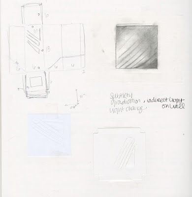
We then chose one of our images to recreate the light within a 6x6x18 box. I first started with a brainstorming page and several smaller mockups:


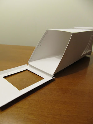
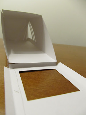
My final design for the light box is below. I chose the angled viewpoint to emphasize the gradation of the light on the wall next to the interior angles:


This past week we started looking at color, using coloraid paper. We explored mixing several colors:


 On the last day, we combined our lightbox concept from the previous week with a color element from the current week. I chose to maintain a similar color palate to my diamond above, but creating new reflective colors within from yellow, pink and teal paper. This 4x4x12 box reflected both peach light and a deeper violet tone in different light conditions: