Wednesday, February 29, 2012

The Dining Experience: A Project


Our design of a dining space was based on several parameters. We were using our dining room table that we modeled the previous week in our design. The dining room table I selected was:


We then had to choose one of four floor plans. I chose 'D' (seen below) for several reasons. First, my table was on the smaller side, only sitting two comfortably. Keeping this in mind, I wanted to choose a room in which the table would not get lost. I also felt like taking on the challenge of plan D in it's square-ness. In addition, two walls were covered mostly with windows or a double door, and I thought this could also prove an interesting challenge.


I then used my original dining space experience collage (see below) as my initial inspiration for the space. I created a client in my mind: an older, art collecting couple that is home mostly in the evenings and lives in an urban area. And I eventually worked my way to the concept of layering as a strategy for my design. I considered layering in both the dining experience and in the textures and details that I chose to incorporate in my space.


Additionally, we had to choose a painting from the Weatherspoon Museum on campus to incorporate into our space. I eventually decided on three different Matisse works: 2 sketches and 1 painting.


Additionally, we needed to have chairs in mind to work with our table. I decided on two orange, leather Parson chairs from Crate and Barrel:

 I started with a few sketches of the space, and then made two smaller sketch models (seen below posing with my bowtie wearing scale figure).


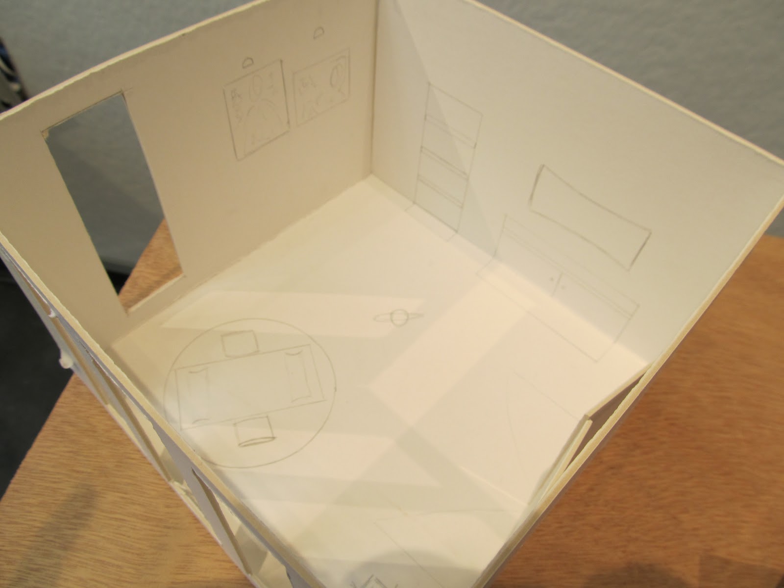
From the smaller sketches and models, I begun to get a better sense of the space in a three-dimensional form, and, after tweaking a few pieces (changed my sideboard, removed a sculpture, added a fireplace, reconfigured the doors) I decided to launch into the full-scale 1":1' model to begin resolving a sense of space and texture.

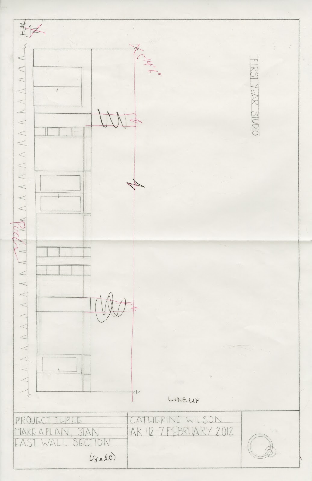
Here we have 4 elevations and a revised floorplan for a better sense of space:


From above, this is the plan view, now in a three dimensional scale:


Additional views:


A closer look at the fireplace, sideboard, and table in the space:


For the ceiling, darker wooden beams cross the room North to South, while smaller, white painted wooden slats cross the ceiling East to West:


And from the floor level, a few images for better understanding a sense of the scale:


Project 4: Ravenna Plan and Section

For this project, we were given a floorplan of the Ravenna Baptistry, which we used to determine the section. My completed versions can be seen below:


A Closeup of Fabric [A3]

Similar to our Wood 12x12, we also made a similar one detailing fabric, as seen below:


A Scaled Dining Table Model

Working with a 1":1' scale, we created a model of a dining room table from our 30x30 dining room table board from the first few weeks of school. My inspiration was this table:

Judith Miller, Furniture

This sketch is from the 30x30 board with dimensions given:


And finally, several images of my completed table:


Monday, February 27, 2012

RR7: Escaping to the Escorial

As we move into the 16th century, Spain takes the stronghold of Europe with its extensive territories across the continent and westward to the new Americas. Relatively new as a powerhouse, the empire needed a central capital, which was created by King Phillip II in 1562, 45 minutes north of Madrid in the Guadarrama Mountains. This expansive palace complex (seen below) was built in the countryside, away from major cities.

http://www.spainthisway.com/images/places/el-escorial.jpg
Philip II was "a deeply religious king and a fierce advocate of Catholicism, and designed his palace in the form of a monastery to symbolize the strength of his faith" (Ching, pg 530). Interestingly, the current trend across Europe at the time was towards classical Roman and Greek ideals infused with grandeur and ornamentation. This palace in many ways was designed as the antithesis of such, to mirror Phillip II's faith. A closeup of the exterior is below.

http://www.artisansofleisuretraveler.com/photos/El_Escorial.gif
A look at the plan of El Escorial will reveal geometric forms and a strong central axis, with the church and dome in the center. The palace gardens and courtyards are specifically incorporated into the design to form the larger square footprint (seen below).

https://blogger.googleusercontent.com/img/b/R29vZ2xl/AVvXsEhEdTCsBQz4ojUgKThTw8wI77NqVCNgeZvJRjdt0EonpBVtTQnflYCNKM-THvJIYPAFK6QGw9JLrj4cIO-HuVsY3NBNRoOIFu_tAeK6ar20WK2xDxpDw4wQ2UOpajQLpkSTYcXQCyJT-K66/s1600/el-escorial-map.jpg
El Escorial has multiple functions, including:
- royal chambers
- monastery
- library
- church
- mortuary for Spanish kings

http://www.spain-holiday.com/blog/wp-content/uploads/2010/07/royal-library-el-escorial.jpg
 The library (above) and the mortuary for Spanish kings (below).

https://blogger.googleusercontent.com/img/b/R29vZ2xl/AVvXsEhvqjMcNIxw5I4o1_CM0V2y_Mf7gvBOCZQdziXg5mrsHBfgRJm_fPhwCy4oengqjbRFeloJ6MFHDoBjawrJH_qmRj09m0VEYqzdGxvYCq5B7FER4oMEud7XiZ1l2HvNomYMUcEEiCOhyU0/s1600/ElEscTomb.jpg
 Perhaps what I find most interesting about El Escorial is its monstrous size and, in my opinion, missed intent. One of the constant themes in the history of architecture and design is that size matters, however I would argue that it does not matter how large your building is if the majority of those to whom you are trying to persuade are too far away to see it. Unlike most other palace centers of its time, this is removed from the people, up in the mountains. While this remote situation undoubtedly reflected its chief patron's personality, I find that the lesson I take from this enormous complex is to make sure you know who and where your audience is. Interestingly, Spain begins to fall from power not long after this palace is built, and is rarely visited today except by tourists.

DA2: Travel (Coffee Mug) Reverberations


Thursday, February 23, 2012

BP6 & 7: Gothic Cathedrals

This week we discussed the era of Gothic cathedrals. Team Indigo was given Cologne Cathedral to explore and compare to Amiens, Duomo, and Salisbury:


Monday, February 20, 2012

RR6: Castel del Monte - Reverberations in Fortifications

With the mobility of people and ideas, there are more variations to architectural forms found in the West during the 1200s. This exchange of ideas as people begin to expand their horizons brings about the fusion of various architectural forms previously defined as separate. The reverberations of these new ideas can be seen across many sites in the West, and the particular site at Castel del Monte is an excellent example of these converging ideas.

http://whc.unesco.org/en/list/398
 Built by Frederick II (r. 1212-50), ruler of both Germany and Sicily, as part of an extensive 200 building campaign, the Castel del Monte (seen above) is quite the exception to the expected at first glance.
http://www.andriaweb.com/casteldelmonte2.html
Built in rural Apulia, Italy, it is thought that the function for this building is for his hawk-hunting expeditions. It is noted for its severity and compactness and unique design unprecedented in Europe (see plan above). Some of its more interesting technical characteristics include:

- equilateral octagonal exterior containing an octagonal courtyard and eight octagonal towers
- mathematically a monohedron with eight symmetrical axes
- rooms surrounding the courtyard are trapezoidal, each with a ribbed groin vault
- three towers contain staircases, others lavatory facilities, while others have no discernible purpose

http://www.paradoxplace.com/Perspectives/Sicily%20&%20S%20Italy/Puglia/Castel%20del%20Monte/Castel%20del%20Monte.htm
Castel del Monte (interior seen above) blends several cultural elements together found from northern Europe, classical antiquity and the Muslim world. Perhaps the most interesting aspect of this building to me is the absence of features that are common to other military buildings of this period (moat, stables, kitchen, chapel, storeroom).


Still residing on the landscape today, albeit abandoned through the centuries, I think this building is particularly interesting in relation to the design world for several reasons. While it definitely combines multiple cultural influences successfully in its design, the single fact that it is located in a rural site and has been abandoned (and once used as a prison) means that there is something left to be desired in the design of this building. I think that the Castel del Monte speaks to the need to maintain both form and function in a design. While the form is interesting, the building itself lacks many of the standard cultural necessities it needs to be truly habitable and to function for humanity. To me, this building is a reminder that while it may look "pretty", if it doesn't have functional elements than no one will want to use it.

Tuesday, February 14, 2012

Foundations: A Unit Review


The first four weeks of this semester focused on the foundations of architecture across the globe. Each week focused on a different concept that helped synthesize the design trends in architecture.

The first week we focused on the concept of object, space, building, place as a tool to define the various scales that make up architecture. We compared and contrasted how various levels of scale can tell about key principles of design for a culture. And through the work of Jules David Prown and Dick Hebdige, we discussed ways to define a culture and subculture and how it relates to the artifact we were studying. For me, the most important moment of the week was when we watched a video by Charles and Ray Eames called the Powers of Ten (which can be watched here: http://www.youtube.com/watch?v=0fKBhvDjuy0). This video for me was the ‘aha!’ moment of understanding the impact of scale in design.

The second week of class introduced the concept of circles, groves and stacks as the fundamental design elements for early architecture (with the addition of the occasional imitation of people). We explored Stonehenge as an example of this concept and discovered that there was actually more than one Stonehenge. The circle, groves, and stacks concept has been integral for me as we moved forward into looking at more complex architectural structures, because by figuring out the basis of organization for architecture, commonalities across cultures and time periods is quite evident, which indicates to me that these three basic design principles are the foundations for basic human organization of spaces as well. We put this concept into practice at the end of the week with a tour around campus, linking the various buildings and spaces on campus with these basic design principles.

 Week three we explored the Acropolis and the Xiang Yang Palace as case studies for the concepts of prototype, archetype and hybrid and the real to the ideal. We looked at comparing and contrasting the two sites that are considered the archetypal temple or palace form for their respective cultures. Both sites are a combination of stacks and groves placed together. Additionally, both sites include a porch, court and hearth, which are key elements found around the globe in the cultural architectural center.  This concept of centrality also became important as we tied it into the first week’s concept of scale, with the ideal world created in the center.

The final week of the foundations unit involved the concept of commodity, firmness, and delight as we explored Rome and its creation of new building types. This organizing principle is used in our text as a way to describe and define the design of various architectural buildings and places. Commodity refers to the function or purpose of the space, firmness is the performance, stability and safety of the space, and the final delight factor refers to the relative beauty of the space. Additionally, Roman architecture developed the concept of the circle as an organizing factor for design, which was seen in domes, arches, vaulting and strong centralized urban planning. We took another tour of campus, this time focusing on various Roman architectural foundations and concepts and how they related to the design (or lack thereof) on campus.

Understanding these basic concepts in the foundations unit has opened the door for a world of understanding to the basic organizing concepts humans have used in the creation of their spaces across cultures. This is particularly helpful in creating my own organizing principles for thinking of design as I begin in this field.  Additionally it has provided for me a basic vocabulary with which to discuss design that is immediate accessible and applicable for today’s architectural buildings. The music building on the UNCG campus is one example of an excellent culmination of many of these foundations concepts, which is in the picture below, taken during one of our tours of the campus. 


Monday, February 13, 2012

Reading Response 5: a caravan through Sultan Han

With the year 1000 CE, most of the major civilizations around the world were focused on the building of sacred spaces (cathedral, mosques, temples, etc) as both cultural and power centers for their societies. Amongst these reinventions of one of the oldest building types, there enters a new building type that I think speaks to a culmination of the travel of ideas and people of this time period.

The best example of this new building type is located in modern day Kayseri, Turkey. The Sultan Han caravansary was created along trade routes as shelter for those traveling and to encourage trade throughout the Seljuk empire.

http://www.turkeytravelplanner.com/go/CentralAnatolia/sultanhani/

The entry portal, above, is covered by a delicate floral pattern (detail seen below), with strong geometric patterning seen throughout the arabic world.

http://www.turkishhan.org/sultankayseri.htm
It is known that there were at least 119 of these caravansaries erected, with this particular one the largest at about 4500 square meters. They were designed to house and protect the caravan drivers, their cargo, animals, and had basic amenities on site. Services were free for the first three days, and all travelers who came to the site were to be treated equally (regardless of race, status or creed).

http://www.turkishhan.org/sultankayseri.htm
The basic design incorporated both a courtyard building and a hall. The plan did vary across canvansaries, but this particular site (shown above) was rectangular with thick stone walls and a large courtyard in the center. The design incorporated space for the following:

- bathing services
- storage
- a treasury
- stables
- physicians
- cooks
- blacksmiths
- musicians

At the center of the caravansary was often a small mosque or prayer room, usually raised above ground level on a stone platform (seen below).

http://www.minicity.antalyanet.de/grafik/bilder/bildmc_DSCF5178.jpg
There are a lot of elements about this particular site that struck me as relevant for today's design world. The various cultures of the world right now are very interconnected and the influence of ideas can spread rapidly with current technology and globalization. This site is one of the first sites that was specifically designed to cater to the transfer of people, goods and services. Because it was created for those on the move, only the "essentials" would be necessary to include in the design. What we consider today the basics needed for travel (a place to sleep, shower, and eat) are obviously included in this design.

What I find interesting are the additional inclusions for musicians (entertainment), a space for worship, and physicians. Additionally, the location of the worship center in the middle of the site speaks to the cultural values of the people at that time. A lot of these characteristics I think could be used in the design of hotels, airports, train stations and other areas that are created for mass transportation, especially when designing to reflect the major tenants of the culture that the building is for.

Perhaps the one aspect I liked the most was the basic rule of no discrimination. I think this is one principal that facilitated the transportation of goods and services and I would argue attracted a wider range of ideas as well. I think this is one aspect that should definitely be considered in great design.

Wednesday, February 8, 2012

BP5: Architecture as Frozen Music

Team Indigo chose an abstract image from Flickr to choose as the inspiration for a poem. My couplet is as follows:

layers of LED
red, green, colors we see
a whole composition
full of repetition

A Cup of Orthographic [A5]


Project Three: First Year Studio


Updated: The following scans show original marked for corrections and the new version below with corrections made.

In Design Visualization, we began working with plans and sections by looking first at the official versions for the studio and then measuring and extrapolating best of our ability what the studio and section look like. 

Plan of First Year Studio:


Section of the South Facing Wall of First Year Studio:


Section of the East Facing Wall of First Year Studio: