Monday, January 30, 2012

Reading Response 3: Teotihuacan Can Plan

Located in Central America, Teotihuacan was one the largest and most impressive cities in the Americas for hundreds of years. Geographically, this culture was far removed from the developments and influences from the other side of the world. What I find so intriguing about this city are the parallels found in architecture and design between the Mayan culture and others across the world, and the lesson that perhaps the foundations of good design are the same for humanity as a whole.

As a whole, Teotihuacan:
-was located in central Mexico
-was built and inhabited for 800 years
-grew from 6000 people to over 150,000 by 600 CE.

http://www.jqjacobs.net/mesoamerica/images/piramide_sol.jpg
The largest Pyramid in Teotihuacan (seen above), the Pyramid of the Sun, was built over a four-chambered cave, which was the hearth of the Mayan empire. Caves were considered integral to the Mayan religion, seen as the origin for the gods and ancestors.

http://www.escapedtolatinamerica.com/images/teotihuacan.jpg
Backing out a bit, at the base of the Pyramid of the Moon is the citadel, which was the center meeting place for the Mayan culture (seen above with the Pyramid of the Sun to the left in the image). There is a raised platform in the middle of the circle, which was oriented at the end of the Avenue of the Dead, the central axis of city.

The repetition of stacks in these pyramid structures is reminiscent of the other sites seen in Mesopotamia, Asia, Egypt and even the base structures of the Acropolis. In contrast, these enormous structures were built from sun-dried bricks without wheels and beasts used in other parts of the world.

http://www.siloam.net/members.aol.com/rex1kids/private/maya1/teotich2.gif

When backing out to the site plan (seen above), perhaps the most striking thing to me about this civilization is the strong central axis and grid pattern. This urban planning method is also seen in other various cultures around the world. The major difference is that here the orientation of the grid pattern is based on the patterns of the sun, moon and stars, which reflects the strong astronomy based Mayan society.

I find this civilization absolutely fascinating for their isolation and major innovations. There is the repetition of other themes found in other parts of the world: stacks, strong centrality, symmetry along an axis. In addition, their strong urban model on a grid pattern reflects a hierarchical society that values order.

I think it is clear as we investigate the foundations of architecture around the world that basic concepts can be seen reflected across many different cultures that had limited interaction with each other. To me, this indicates that humanity has common principles of design that are pleasing across cultures. This universality is important to me as I begin to piece together my first designs. Balance, symmetry, order, circles, groves, and stacks are all fundamental elements to consider and potentially incorporate in my designs.


Blog Post 3: xiangyang and the acropolis - comparison and contrast


The Acropolis and Xiangyang Palace were both constructed around the same time period but were geographically and culturally far apart. In class, we began to compare and contrast these two great cultural centers. In keeping with the discussion of circles, groves, and stacks, both of these sites were the cultural centers of the empire (circles) and architecturally reiterated the mass of inhabitants (groves) in the fortification of the place (stacks). Scale plays a big role as well, not only to emphasize that size does matter, but also that within the context of a hierarchy of scale, diving through the multiple layers leads to the hearth. Xiangyang Palace is more proportionate and balanced (despite being over four football fields in length!) where as the Acropolis itself winds it way through the site to the Parthenon that is the Athenian's concept of the ideal perfected. Both sites set the architectural precedent for their cultures with these sites. They had impressive technology built of materials found within the immediate environment, built to last an eternity. This is seen with the large stone construction at the Acropolis and the 1000 terracotta soldiers buried below the landscape.

the dining experience: an abstract collage


An 8"x8" abstract collage of what I think of the dining experience. I chose to splice and layer several images together to create a visual representation. My thought was that there are multiple senses engaged when dining and I wanted to include multiple images. The idea was dining outside during sunset on a patio, with lights overhead and a view of the town through the trees disappearing in the distance. I chose to not represent the dining experience as simply food. The poetic breakdown is as follows:
-Sunset to set the mood, a sense of ritual.
-Bricks as an element of texture and color, grounding the space.
-Overhead lighting to create a sense of intimacy.
-The orange dahlia for color and perhaps a centerpiece or focal point on the table besides food.
-Trees and the town for building, space, and place.


Project 2: Value & A2: Wood Grain

Week Three of design visualization included a value scale and a wood grain rendering:


Sunday, January 22, 2012

Reading Response 2: the Erechtheion

In keeping with this week's discussion of circles, groves, and stacks, the Erechtheion at the Acropolis in Athens struck me as a an example of the fourth category, "people." Additionally, I find the plan intriguing in its irregularities for a culture that so highly valued a more symmetrical plan for its temples.

http://content.lib.washington.edu/cgi-bin/showfile.exe?CISOROOT=/buildings&CISOPTR=1343


The Erechtheion is a small temple built on the Acropolis (found at the top of the image) that is notable for its irregular architecture. Compared to the Parthenon and its symmetry along the center axis, the Erechtheion mimics some architectural features of the Parthenon but also has more fluidity.

http://www.lanecc.edu/arts/ArtHistoryProgram/images3/5-51Plan.jpg

The irregular building plan has been contributed to the need of the Athenians to have a sacred space that incorporates many different narratives vital to their identity as a culture. The Erechtheion housed the cult statue, has a hole in the ceiling where Zeus threw a thunderbolt and struck the rock foundation producing water, shelters Athena's olive tree, and reaches into the corner of the original Erechtheion site.

http://math.ucr.edu/home/baez/diary/athens/athens_erechtheion_1.jpg
In keeping with the analysis of this past week's early architecture design foundation, the Erechtheion clearly shows both the concept of groves (the columns) and stacks (by not only housing their cultural knowledge, but by also sitting atop a mountain).

http://brianabbott.net/media/photos/travels/greece-by-land/DSC02759-1024.jpg
Additionally, the Erechtheion speaks to the fourth design concept of people. The caryatids are stone columns that appear as sculpted females. An interesting inclusion as a design element for such a sacred space, my inclination is that they are there to remind those in the city of the Erechtheion's role  of housing the culture of the people.

Circles, Groves, Stacks: Blog Post 2


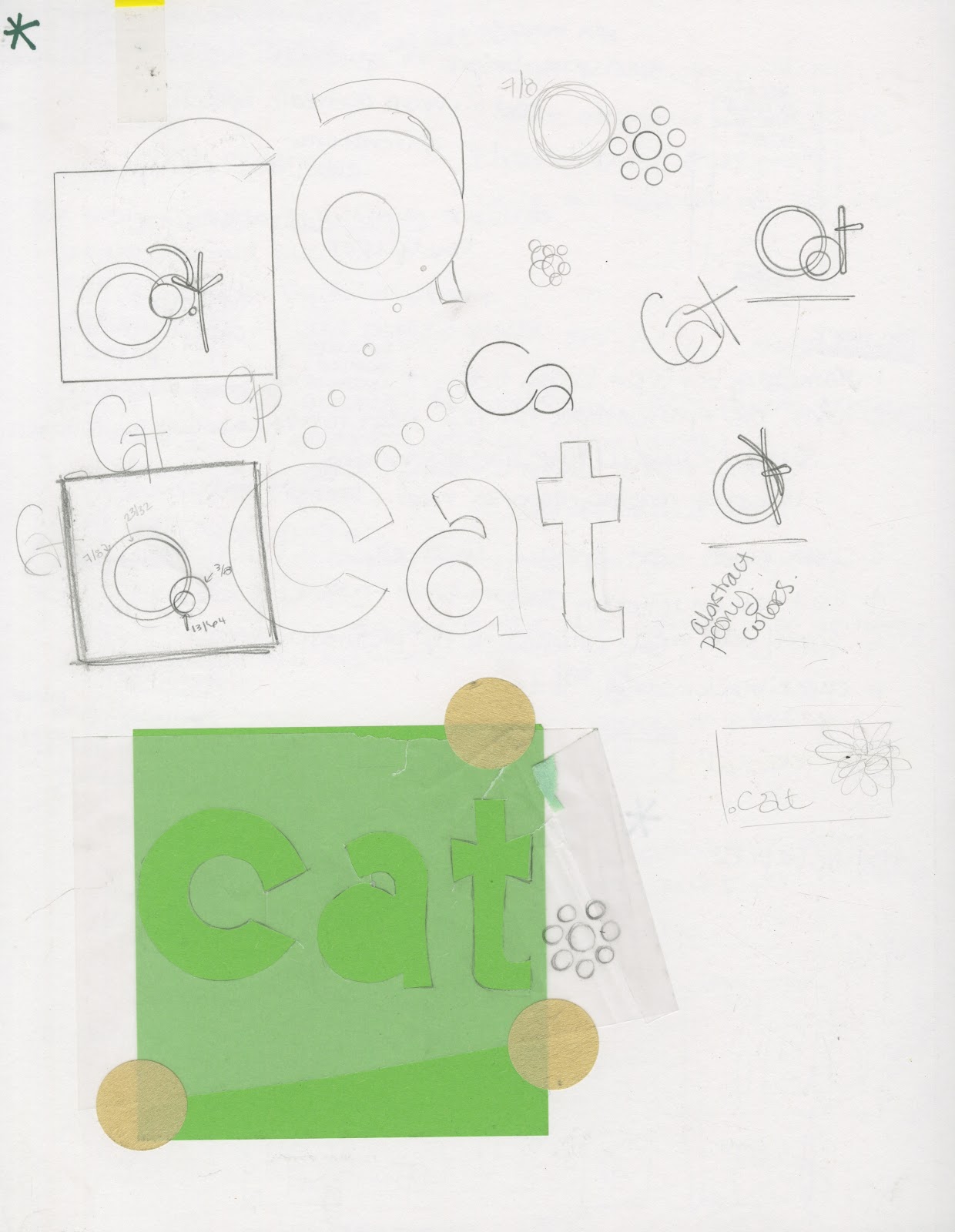
One of the design principles we looked at this past week throughout the history of design and early architecture was the repetition of circles, groves, and stacks in design. We took a walk around campus on Friday looking for examples of circles, groves and stacks on campus. Most of the places we walked implemented at least one of these design elements. Here we have a covered walkway from Ferguson:


The repetition of the columns speaks to the concept of groves, which stems from the idea of groves of trees reaching vertical mimicked in the created spaces around us. The arches between the columns are also repeated along the bottom row of windows and the circular planters next to the trees (viewed through the columns).


Team Indigo took a walk down College Ave to the Music Building to check out more of the campus.


College Avenue cuts right through the heart of campus. It begins perpendicular to Spring Garden and at the Music Building. There is a  repeating series of squares and circles along the road, with the center circle the largest of the rest (seen above). This center circle marks the center of campus, with the library to the west. The concept of the circle often signifies a sacred place.


Standing in the center of the circle in the center of campus looking west, is the library. It has a circular entrance with columns (groves) that opens up to stacks of books. The concept of stacks signifies the gathering of resources, which for academia is knowledge. The center of knowledge is the library, here directly off the center of campus.


The Petty building on the other side is another excellent of all three design principles in the outside architectural design alone. We have the repetition of the circular concept (two symmetrical arcs connected through the negative space) in the stairs, bridge supports and sidewalk below. The columns at the entrance speak to groves, and the rows of windows on top of one on another speak to stacks.


Off College Ave heading towards the music building, the path intersects several large dorm buildings. These buildings speak to both stacks (of windows and floors) and groves (of students).


The walkway to the music building (the red tower building above) has repeating arches (circles) and horizontal bands of steel (stacks). These pick up on the theme of the cylindrical building at the end of the walkway, held up by thick columns (groves). There are horizontal bands in the red brick that also hint at the concept of stacks.


The garden outside of the music building also keeps the same theme running, with groves of trees, a circular man-made pond, with a fountain from a stack of stone.


The interior of the tower at the entrance is an open circle with the groves of trees from the park visible through the man made columns. 


Inside the theme continues, with a repetitive circular pattern on the floor, and the real groves of trees seen through the man made groves of columns and stacks of windows. A clear indication of the relationship of the man made world and the natural environment. 


In the center of the music building where the various wings meet, underneath the repeating circular space, with its horizontal bands, is the one anomaly to the circles, groves, and stacks concept of design: people. There is a statue indicating a clear human presence, playing a trumpet (a clear nod towards the music building). 

This journey across campus makes a solid case for architecture and design that stems from rituals influencing the creation of environments. There are themes constantly represented across the campus that are decidedly used in the design and construction of the buildings. I would make an argument though, that once the environment is created, it often contributes to the creation or adaptation of new rituals. The location of the music building away from the main part of the campus most likely lends its students and faculty a more isolated sense of community, where "running for a cup of coffee" would elicit more time and planning, then say, those in the psychology building that are located next to Tate St. I think that the sometimes environments influence rituals and sometimes rituals influence the environment.

The Evolution of a Dining Room Table

Our first project in environmental studio was a 30x30 board with five different dining room tables depicted. I chose to create a timeline and incorporate five different dining room tables from different time periods, starting with Renaissance Italy and moving into Mid-Century Modern:


MLK's speech for MLK day: a lettering project [P1]

These are images from my first attempt at architectural lettering. Architectural lettering involves using a straight edge for all vertical lines, while all horizontal lines are free handed on a slight diagonal. The key is to keep all your letters between the guidelines and for them to be consistent throughout. I found drawing an 'R' the hardest for some reason. This lettering project was a little meditative for me after I got into the groove of it. I really enjoy the more humanist, san serif fonts personally, anyway.

Practicing Architectural Lettering:


This is the full 11x17 vellum:


A detail shot of the lettering - note the inconsistent 'R':


Perhaps the most creative aspect of the assignment for me was creating a "trademark" sign. This is a little symbol made from drafting tools that is in the bottom right hand of every page. I originally wanted to incorporate "Cat" in my trademark, but all the versions I created were either too busy or looked like a sports team logo. I settled on the following because I liked its simplicity and how asymmetrical the two open circles are:


Below, the fully scanned image:


Tuesday, January 17, 2012

Reading Response 1: Çatalhöyük

Çatalhöyük:

 An early urbanization model.
7400 BCE. Population 8000. No streets.
http://www.ritualgoddess.com/aboutcatalhuyuk.htm
  Constructed of mud bricks and wooden posts, this honeycomb patterned city was built without streets or passageways. Inhabitants moved about along the rooftops of the city and lived below,  accessed by ladder through holes in the roof. 

http://www.ritualgoddess.com/aboutcatalhuyuk.htm
  The family unit lived in one main room. Walls were plastered and often painted with scenes depicting the local landscape or hunting adventures. There was no central communal sacred space, so each house had its own shrine with bull horns and bones from the deceased.

http://leavingbabylon.files.wordpress.com/2010/09/catal2.jpg
http://www.catalhoyuk.com/history.html
 
To the left, a plan from the archeaological site as we can render it to the best of our knowledge.


Below, a plan of the city of Washington, DC. This relatively modern urban plan incorporates streets and passageways, but the general geometric pattern remains. 

http://www.thenowpass.com/wp-content/uploads/2010/09/LEnfant_plan.jpg


The patterns of urban development in Çatalhöyük and those of modern cities like Washington, DC both include repetitive geometric shapes. Studying these ancient civilizations can shed light on humanity’s intuitive urbanization plans.

http://globalheritagefund.org/images/uploads/projects/catal_overview_main.jpg

*All information regarding Çatalhöyük is from our class texts: Ching & Roth.

Monday, January 16, 2012

Design Autobiography 1


My name is Cat and I enjoy my morning cup of coffee. I chose this extra large stainless steel travel coffee mug for my well-designed object. I personally have a very hard time functioning (or even being a civil human being) in the mornings without my morning cup of coffee. I drive from Winston every morning to get to class, and I have found this mug particularly invaluable for my daily commute to get to class on time and without a major coffee stain somewhere on my person. Additional features include keeping my coffee hot for much longer than my other travel mugs, having an additional outside plastic barrier that is great for preventing damage from those inevitable falls, and last but not least, coming with a dry erase marker for personalization. This travel mug definitely boasts equal function and form for me. 

According to Jules David Prown's assessment of culture and how it relates to my travel mug, he uses three major tools for analysis: description, deduction and speculation. My travel coffee mug is stainless steel on the interior with a plastic drinking cap that seals itself shut and an outside plastic cover. Most of the coffee brewed in the carafe from my four cup coffee maker will fit inside this travel mug, which means it holds an even greater amount of liquid than the standard travel mug. It also fits snugly in my hand.  

As it relates to the subculture theory from Dick Hebdige, this coffee mug can hark to the tension between independent cafes and corporate coffee shops (ie: Starbucks) that are common in American society today. Independent coffee shops in Winston are typically painted dark colors and are filled with second hand furniture and local artists' work for sale on the walls. The coffee sold is fair trade and organic. This juxtaposes with the beige and green interiors of Starbucks with their large windows and white wood counters and matching tables and chairs. The culture at large in America seeks out the corporate version far more often, and versions of this mug are often lining the shelves for sale.

What's in a name? [A1]

Our very first project for Design Visualization this semester was to create a name card. The parameters were to use an 8.5 x 11 sheet of paper. I found a pearlescent, textured paper that I chose to use as the background for my name card because I loved the tactile quality and thought it gave the card more depth. I decided to create my name using a more humanist based font in a happy green color. Both of these decisions probably tie into my psychology degree roots. I decided to keep the decoration minimal, allowing the textured paper to be a larger part of the design.