Monday, February 13, 2012

Reading Response 5: a caravan through Sultan Han

With the year 1000 CE, most of the major civilizations around the world were focused on the building of sacred spaces (cathedral, mosques, temples, etc) as both cultural and power centers for their societies. Amongst these reinventions of one of the oldest building types, there enters a new building type that I think speaks to a culmination of the travel of ideas and people of this time period.

The best example of this new building type is located in modern day Kayseri, Turkey. The Sultan Han caravansary was created along trade routes as shelter for those traveling and to encourage trade throughout the Seljuk empire.

http://www.turkeytravelplanner.com/go/CentralAnatolia/sultanhani/

The entry portal, above, is covered by a delicate floral pattern (detail seen below), with strong geometric patterning seen throughout the arabic world.

http://www.turkishhan.org/sultankayseri.htm
It is known that there were at least 119 of these caravansaries erected, with this particular one the largest at about 4500 square meters. They were designed to house and protect the caravan drivers, their cargo, animals, and had basic amenities on site. Services were free for the first three days, and all travelers who came to the site were to be treated equally (regardless of race, status or creed).

http://www.turkishhan.org/sultankayseri.htm
The basic design incorporated both a courtyard building and a hall. The plan did vary across canvansaries, but this particular site (shown above) was rectangular with thick stone walls and a large courtyard in the center. The design incorporated space for the following:

- bathing services
- storage
- a treasury
- stables
- physicians
- cooks
- blacksmiths
- musicians

At the center of the caravansary was often a small mosque or prayer room, usually raised above ground level on a stone platform (seen below).

http://www.minicity.antalyanet.de/grafik/bilder/bildmc_DSCF5178.jpg
There are a lot of elements about this particular site that struck me as relevant for today's design world. The various cultures of the world right now are very interconnected and the influence of ideas can spread rapidly with current technology and globalization. This site is one of the first sites that was specifically designed to cater to the transfer of people, goods and services. Because it was created for those on the move, only the "essentials" would be necessary to include in the design. What we consider today the basics needed for travel (a place to sleep, shower, and eat) are obviously included in this design.

What I find interesting are the additional inclusions for musicians (entertainment), a space for worship, and physicians. Additionally, the location of the worship center in the middle of the site speaks to the cultural values of the people at that time. A lot of these characteristics I think could be used in the design of hotels, airports, train stations and other areas that are created for mass transportation, especially when designing to reflect the major tenants of the culture that the building is for.

Perhaps the one aspect I liked the most was the basic rule of no discrimination. I think this is one principal that facilitated the transportation of goods and services and I would argue attracted a wider range of ideas as well. I think this is one aspect that should definitely be considered in great design.

Wednesday, February 8, 2012

BP5: Architecture as Frozen Music

Team Indigo chose an abstract image from Flickr to choose as the inspiration for a poem. My couplet is as follows:

layers of LED
red, green, colors we see
a whole composition
full of repetition

A Cup of Orthographic [A5]


Project Three: First Year Studio


Updated: The following scans show original marked for corrections and the new version below with corrections made.

In Design Visualization, we began working with plans and sections by looking first at the official versions for the studio and then measuring and extrapolating best of our ability what the studio and section look like. 

Plan of First Year Studio:


Section of the South Facing Wall of First Year Studio:


Section of the East Facing Wall of First Year Studio:


Monday, February 6, 2012

Reading Response 4: Buddhism Foundations in the Ajanta Caves


http://whc.unesco.org/uploads/thumbs/site_0242_0001-469-0-20110415171012.jpg
The 'caves' at Ajanta are the largest group of Buddhist rock-cut meditation chambers and dormitories found anywhere in South Asia. Carved from a cliff edge that was formed by the Waghora River, there are about 30 different caves following the horse-shoe shaped ridge (seen above).
 
https://blogger.googleusercontent.com/img/b/R29vZ2xl/AVvXsEiZozWumcaF64XRM4G0hMhWQQk0wa1Utzp4_aEVAv1RYGcgTtVgJaSTSIPfM-FJpVePOWCGR7AkaAicisqWWYsbBp6XPimqKBm4JqedWq_fmGlowY2M2d50Yyk1FI9pzhWBk0NE1o_1P10/s640/4.jpg
 The caves in the center (seen above) are the oldest, dating from about 390CE and the outer ones that fan out are newer and more elaborate, with greater decoration and architectural forms signifying Buddhist principles that were more common and evolved as Buddhism itself evolved.


http://www.rocksea.org/images/maharashtra/ajanta/slides/ajanta_caves_chaitya_02.jpg
The Buddhist monks were encouraged to create Buddha figures and decorate the interiors of the caves. The columns are sculptural with floral and figural representations. This symbolism stems from the original garden where Buddha preached and gained enlightenment. Most surfaces were painted and decorated, integrating art, sculpture and architecture.

This is a key point of humans shaping the world around them to reflect their own needs: by carving architecture into stone (an eternal medium that endured more than the typical regional use of mud and wood) and decorating with symbolism. Interestingly, caves draw a parallel to the foundations of human habitation, which were in natural caves that were also decorated.

One of the most interesting aspect of this site to me is the architectural interior plan of the caves seen below:


There are several parallels of this plan with those seen in Roman and Egyptian cultures, including, but not limited to:
-hypostyle hall
-centrality with a strong center axis
-repetition of circles and squares
-clear division of interior space using a bay and columns
-circles as sacred places

This last point can also be seen with the horseshoe shaped ceiling found above the central figure of Buddha in the cave image below:

http://www.impactlab.net/wp-content/uploads/2010/11/ajrock11.jpg
For me, the foundations of architecture resonates across all cultures and sacred spaces. The inclusion of circles, squares, and figures can be seen in cultures that are traditionally considered vastly different. When looking at the similarities of how humans have decorated their sacred interior spaces, I think a strong case can be made for various cultures having stronger similarities than differences.


Sunday, February 5, 2012

BP4: intent vs. actuality: the EUC and campus centrality


Meet the EUC. This is one of the first buildings that you find when you come to UNCG. Designed as the student center of campus, this gathering place has all sorts of various functions, including rooms for meeting, meditation, food, coffee, books and UNCG logo'd paraphernalia. The career center is housed in the basement and there is a special interior walkway that leads to the library next door. Interestingly, this facade is off-center towards the left of the building. The walkway leading to the front door comes from this:


Past the awkward large circle and giant sculpture, in the far distance of this image, is a tower that signifies the Oakland Parking Deck. Interestingly, the tower from the parking deck is off-center to the central sidewalk axis that leads to the main entrance to the EUC. Heading towards the parking deck, the axis fizzles out and disappears. This is one of the first signs of the intent of the designers to signify centrality with the actuality being a near miss.

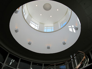
Once past the row of columns on the exterior of the EUC, we enter into a tall cylindrical space. Circles throughout history signify sacred places, or central spaces. This tall cylindrical entrance emphasizes its verticality with a ring of clerestory windows at the top and shafts of lighter material drawing the eye up. At the top there are a ring of circular lights. And at on the floor, there is another circular form: 


While standing in this space, there are three options for movement. To the left is the bookstore, to the right a small ala carte cafeteria, and straight ahead a long hallway that leads to the back side of the building. Interestingly, only the center axis maintains the movement centrally. The entrances to the left and right both have doors that are off center and awkward for movement.

Before continuing on the central axis, there is the UNCG keystone with Minerva. This is perhaps one of the few times that the intent to express a key focus of the university is actually placed in the center of the space.


Towards the back is a second main entrance to the building, from a lower level. There is a spiral staircase that connects all three levels and creates it own cylindrical echo to the front entrance of the building.


At the top, a second cylinder with a ring of clerestory windows ties the the entrance. This cylinder is smaller, but the basic design principles are the same. 


This central axis of the EUC, despite its inconsistencies, probably reaches the highest levels of achievement in commodity, firmness and delight. The two cylinders mark this building as the center for gathering for the student community, which I think this building achieves fairly accurately for such a commuter-based university. The commodity aspect of this building is implemented accurately in its consideration for having a central location for places a student would need to visit while on campus. The firmness aspect takes into consideration the movement and flow of traffic through the central axis of this building, housing many various functions and even including a side entrance to the library. While delight encompasses the connectivity of two cylindrical spaces, the ring of clerestory windows and the fluidity of movement of the staircases as they connect the multiple floors.

Sections of Dining [A4]

This past week's design visualization 12x12 included 9 sketches of my proposed dining room in plan and section, which is included below: